
Redesigning BridgeLegal's Matter Page
At BridgeLegal, I led the redesign of the Matter Page to streamline client handoffs and improve user experience. Users struggled to find information due to a cluttered layout and complex navigation, leading to inefficiencies like excessive emails and meeting coordination.
I focused on improving the information architecture by creating a centralized hub for client data, introducing clear read/edit modes, and simplifying navigation. This resulted in better user engagement, increased efficiency, and positive feedback from stakeholders and end users.
TL;DR
I redesigned the Matter Page of BridgeLegal’s CRM to reduce friction during client handoffs. The redesign streamlined navigation, clarified content hierarchy, and boosted workflow efficiency for both task-based and data-driven users.
COMPANY NAME
BRIDGELEGAL
ROLE
PRODUCT DESIGNER
TEAM
CTO
PRODUCT MANAGER
INTEGRATION ENGINEER
FRONT_END ENGINEER
TOOLS
WHIMSICAL, FULLSTORY, FIGMA
TIME
8 WEEKS
Research Plan
Project Background:
At BridgeLegal, we identified an issue during client handoffs:
Despite having all client data centralized in the Matter Page, users frequently bypassed it due to its cluttered layout and complex navigation. This led to inefficiencies like repeated emails, redundant meetings, and frustrated handoffs, ultimately impacting team productivity and client satisfaction.
After observing user behavior, we discovered that though the information was available, the presentation was cluttered and not intuitive. We conducted user interviews to uncover key pain points and understand how to improve the user experience.
Research & Insights
To uncover user pain points, we took a multi-faceted approach:
Stakeholder Interviews: We spoke with key stakeholders to understand business goals and operational challenges.
User Interviews: We conducted direct user interviews to gather insights on daily pain points and behavioral patterns.
Session Analysis: We reviewed user sessions through FullStory to track navigation patterns and identify where users faced friction.
Synthesis & Affinity Mapping:
I synthesized the research findings using affinity mapping, which allowed me to identify patterns and group related issues. This method helped uncover key themes, such as navigation friction and unclear hierarchy that directly informed our design decisions.
EDIT MODE
The default edit mode was difficult to use when users only needed to read or copy information.
NAVIGATION
Excessive layering made navigation cumbersome, forcing users to open multiple pages and switch between tabs frequently.
LAYOUT
The layout was bulky and lacked a clear information hierarchy, making it hard to find key details.
FEEDBACK
Visual feedback was limited, especially since most users were accessing the platform on desktop devices.
Uncovering friction points

All the necessary details are hidden under a maze of information which is hard for users to navigate through.
The first view only presents the users with the intake form. Each form field is also presented as a editable field.
There is no activity for the matter's journey.

The contract which is one of the most used feature is hidden away under the vertical tab.
The documents tab does not include the contracts which was confusing for many users.
Course of action:
01
User Segmentation:
-
Action-Oriented Users – Back-office employees, paralegals, and other users who actively perform tasks (e.g., updating contracts, Verify ID, Download documents..).
-
Information-Oriented Users – Operations leads, attorneys, and funders who primarily need to view and analyze data for case evaluation.
02
Focus on Information Architecture:
We prioritized identifying the key information users need and presenting it in a clear, intuitive structure.
03
Streamline Navigation and Reduce Friction
We simplified the navigation structure by reducing the number of layers and consolidating related information, making it easier for users to complete tasks without switching between tabs.
04
Improve Visual Feedback and User Interaction
We added real-time status updates, loading indicators, and clear confirmations to enhance user confidence and create a more responsive experience.
Based on our research insights, we defined a clear course of action: simplify the user experience, restructure information architecture, and tailor the interface to meet the distinct needs of action-driven and information-focused users.
Defining the users
We defined two distinct user groups based on behavior and goals. Those who actively performed tasks and those who primarily consumed information.
This segmentation allowed us to tailor the interface to better support each group’s needs.
Action-Oriented Users:
Back-office staff, paralegals etc
Action-Oriented Tasks:
-
Client communication
-
Uploading documents
-
Tracking medical/pharmacy records
-
Filling forms
-
Updating case status


Information-Oriented Users:
Operations leads, attorneys, funders etc
Information-Oriented Needs :
-
Form progress
-
Docket information
-
AI-generated summary
-
Upcoming activity
-
Matter journey
Building the solution
To address these challenges, we focused on simplifying the user experience and improving the information architecture of the Matter Page. Our goal was to create a single, centralized hub where users could easily access and manage all client-related information. By streamlining navigation, enhancing read/edit modes, and providing clear visual feedback, we aimed to make the Matter Page more intuitive and efficient for both action-oriented and information-focused users.
Centralized Information Hub
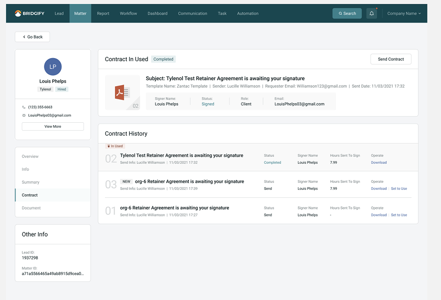
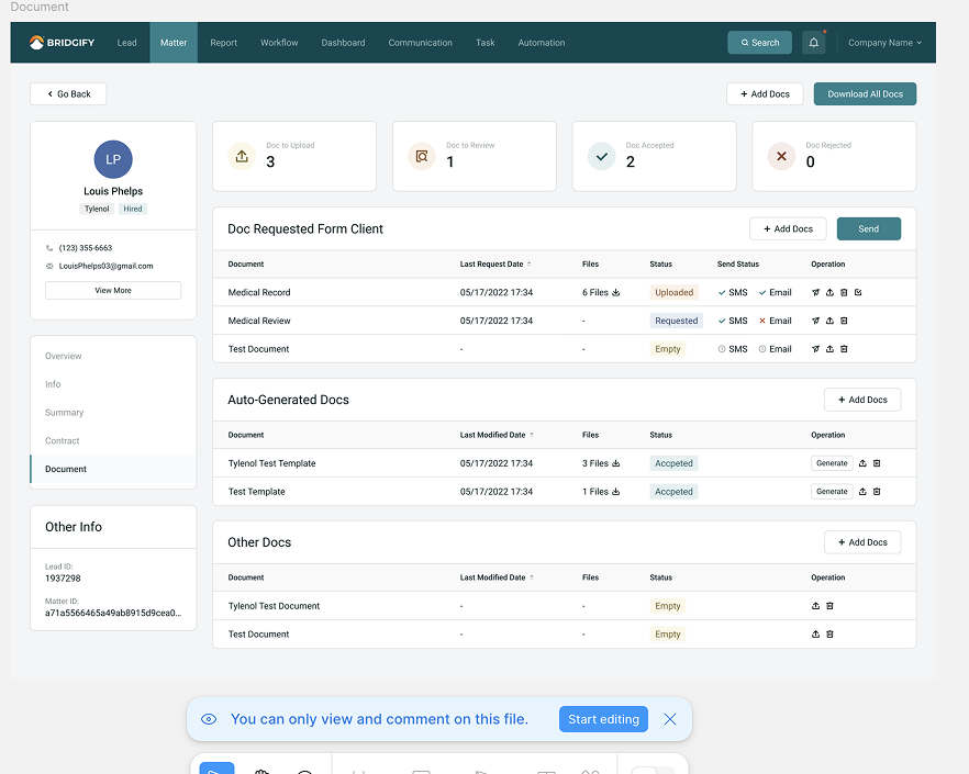
Transform the Matter Page into a single stop for all client-related needs:
-
upload/download contracts
-
answer questions
-
client/company information
-
schedule meetings
-
visualize deal status
-
sign contracts
Simplified Navigation
Reorganize the matter page structure to reduce clutter and layering. This will make it easier to find all the key information quickly.
Enhanced Read/Edit Mode
Introduce separate read and edit modes to make it easier for users to switch between reviewing and updating information.
Tailored User Experience
We segmented users into two groups:
-
Action-Oriented Users – Back-office employees and paralegals performing tasks.
-
Information-Oriented Users – Operations leads, attorneys, and funders focused on analyzing data.
Add a Title
Add paragraph text. Click “Edit Text” to update the font, size and more. To change and reuse text themes, go to Site Styles.
Uncovering friction points
All the necessary details are hidden under a maze of information which is hard for users to navigate through.
The documents tab does not include the contracts which was confusing for many users.
The first view only presents the users with the intake form. Each form field is also presented as a editable field.
There is no activity for the matter's journey.
The contract which is one of the most used feature is hidden away under the vertical tab.
The Problem Statement
The Matter Page was intended to be the central hub for client handoffs and case management at BridgeLegal but users weren’t using it that way. Despite containing all the necessary information, the page’s cluttered layout and complex navigation created significant friction.
Users struggled to quickly find key details and often switched between multiple tabs and tools, leading to task inefficiencies. The default edit mode added to the confusion, especially for users who only needed to view or reference information. As a result, teams lost time on repetitive tasks like emailing contracts or manually coordinating meetings ultimately impacting productivity, collaboration, and user satisfaction.
Building V1
Version 1 was built with including several new key features to the matter page. Some of them was including “an edit and view mode” , separating actionable items from visual ones, introducing a new page called the “over view” page to lay out all the important information and activity.

Initial Ideas
After talking to both the user groups and observing how users worked with the matter page during their calls I started sketching out my initial designs on Whimsical.
-
I started of with wire framing the main pages of the matter page. I explored quite a few layout for the overview page.
-
For the documents page I toyed with the idea of having both a list and a grid view.


The main challenge was redesigning the intake forms on the matter. I added a view/edit mode for the forms as well, the default mode would depend on the type of user.
I added a header that would hold the client’s personal info, the status of the matter, and the organizations details.
I also introduced a nav bar, since the forms are too long and we found out that users spend a long time scrolling through them.


Feedback & Next Steps:
The feedback from stakeholders and users was overwhelmingly positive.
The sales team appreciated the high-fidelity prototype, which became a valuable tool for pitching to new and existing clients.
Testing with the back-office users reported in an improved experience with more streamlined workflows and intuitive navigation.
The working prototype was well documented and passed on to the Dev team for final handoff.