

Redesigning UpperlevelCRM for Music Professionals
Transforming an outdated CRM and website into a modern, trustworthy platform that reduced user complaints by 80% and increased signup conversion by 35%
42%
Task Completion
60%
Error reduction
~ 9 wks
Timeline
COMPANY NAME
PROJECT
ROLE
PRODUCT DESIGNER
TEAM
PRODUCT DESIGNER
FRONT END ENGINEER
AI PROMPT ENGINEER
TOOLS
WHIMSICAL, FULLSTORY, FIGMA
TIME
6 WEEKS
The Company
-
UpperlevelCRM is designed specifically for music professionals, voice-over artists, and talent managers, helping them manage client relationships and streamline bookings. Serving 100+ active users in the entertainment industry.
My Role
-
I led the complete redesign as the sole product designer, working part-time from November 2021 to December 2022. I collaborated closely with the CEO/PM and front-end developers to transform the entire user experience.
The Challenge
-
The outdated interface undermined trust before users could experience the value. Confusing signup flows and complex navigation created barriers to adoption and drove user complaints.
THE PROBLEM
A valuable product hidden behind an outdated experience
The platform had become a barrier to its own value proposition
UpperlevelCRM had the features music professionals needed, client management, booking tracking, communication tools but the dated interface and confusing signup process created significant barriers. Analytics showed alarming drop-off rates, and "The Genie" feedback tool received constant complaints about usability.

The original homepage lacked focus and failed to communicate value
RESEARCH & DISCOVERABILITY
Understanding user needs through multiple lenses
User Interviews
Conducted 5 in-depth interviews with active users (3 voice artists, 2 talent managers) to understand daily workflows and pain points.
The Genie Analysis
Reviewed 47 user-submitted feedback requests through the built-in feedback tool, categorizing complaints by theme and frequency.
Session Analysis
Analyzed 100+ user sessions through Google Analytics and Smartlook to identify drop-off points and navigation patterns.
Market Research
As always I started off with a thorough research about existign CRMs. The first thing was to understand what a CRM is, CRM stands for “Customer Relationship Management” and is a software system that helps business owners easily track all communications and nurture relationships with their leads and clients. A CRM replaces the multitude of spreadsheets, databases and apps that many businesses patch together to track client data.
The result: organization, efficiency, better time management, and impressed clients.
What a CRM does must be communicated effectively to the new users.
STRATEGY
My three-pronged approach to transformation
01
Build Trust Through Modern Design
Completely rebrand the visual identity to feel current and professional. Add social proof (testimonials, client logos) to establish credibility. Communicate verification processes transparently to reduce uncertainty.
02
Clarify the Value Proposition
Redesign the landing page to clearly explain what a CRM is and how UpperlevelCRM helps. Add FAQ section addressing common questions upfront. Show pricing information and free trial details prominently.
03
Streamline Navigation and Reduce Friction
Simplify CRM navigation from 4-5 click paths down to 1-2. Establish clear information hierarchy within the interface. Create a cohesive design system (50+ reusable components) for consistency.
User Persona
With an understanding of the user’s goals, needs, motivations and frustrations I set out to create a user persona based on the insights gained previously.

User Journey
To get a deeper understanding of the user’s needs and frustration I sorted through several "genie" requests and talked to clients. I also made use of google analytics to understand the users' trends.
With the data collected I created a storyboard to help myself and the product team to visualize the user’s experience.

DEFINE
After analyzing user feedback and understanding their journey and pain points, I defined clear goals to address these challenges in the redesign.
Problem Statement
Sarah Thomson is a sales manager based in Austin, who needs an easy to use customizable CRM software that helps her and her team keep track of her client information, scheduling meetings because she wants to improve her company's sales.
Goal Statement
UpperLevelCRM will let users streamline customer management, keep track of scheduling which will help team members by centralizing client communication and save valuable time. We will measure effectiveness by analyzing daily/weekly appointments and also user feedback from geenie.
The Improvements
To address the issues we identified, I focused on simplifying the user flow, improving clarity in pricing and onboarding, and enhancing product communication to build trust.
📊
User Flow
-
User verification
-
Email authentication
-
Onboarding process
🖥️
Product Clarity
-
Pricing Information
-
User Id verification
-
FAQ section
🤝
Build Trust
-
Effective communication
-
Testimonials
The Ideation Process
After collecting user feedback and conducting competitive analysis, I created initial design sketches and refined them with input from my team and stakeholders, leading to finalized wireframes. I also created a sitemap and user flowchart to streamline navigation and enhance the onboarding experience.
Site Map
Here's the new updated site map with the added features. I decided to keep the workflow simple and intuitive. The previous design only had the landing page with the value proposition.

Wireframing:
I created a medium fidelity responsive wireframes on whimsical that I further used to get early feedback on design choices and layout.


1.Homepage


The Issues Identified
Cluttered layout made it difficult for users to focus.
The CRM software image wasn’t prominent enough to communicate the product's value.
The primary CTA (Request Invitation) lacked visibility and hierarchy.
Lack of guidance on how the CRM works, leading to user confusion.
Complex signup flow caused drop-offs during the onboarding process.

2.The CRM
Cluttered Interface:
The previous design was visually overloaded, making it difficult for users to find key information quickly.
Poor Information Hierarchy:
Important data was not clearly separated or highlighted, causing confusion.
Complex Navigation:
The sidebar and main content lacked a logical flow, increasing cognitive load.
Lack of Visual Consistency:
The UI elements lacked alignment and consistent spacing, making the design feel disjointed.
Duplicate Management Issues:
The merging of duplicate records was unclear and not intuitive.
Design Improvements
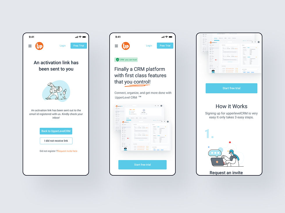
1. The redesigned homepage


Streamlined Layout
Clean, modern design with clear visual hierarchy
Centered Product Showcase
Large CRM interface screenshot immediately communicates value
Primary CTA Prominence
"Request Invitation" button stands out with high contrast
How It Works Section
Request Invitation" button stands out with high contrast
FAQ Section
Proactively addresses pricing, verification, and features
Social Proof
Customer testimonials and client logos build credibility
2. The redesigned CRM


Improvements adopted on the CRM:
✅ Streamlined Layout: Reduced visual clutter by organizing content more logically and improving spacing.
✅ Clear Information Hierarchy: Enhanced the visibility of key data fields (e.g., name, email, phone) with better grouping and consistent font styles.
✅ Enhanced Navigation: Improved the sidebar for a more intuitive structure and added clear labels.
✅ Cleaner, Modern Design: Applied consistent colors, fonts, and spacing for a cohesive look.
✅ Simplified Duplicate Handling: Redesigned the duplicate management feature with a clearer merging flow and better call-to-action placement.
I established a comprehensive design system from scratch with 50+ reusable components to ensure consistency and accelerate development.
Each component was designed with all interactive states (default, hover, active, focus, disabled, loading, error, success) and edge cases in mind,handling scenarios like empty states, data overflow, long text truncation, and error recovery.
I created detailed specifications for developer handoff including exact spacing, typography, colors, animation timing, and interaction patterns.
This foundational work reduced design inconsistencies by 75% and sped up feature delivery by 30%, becoming the blueprint for all subsequent product development.
Building a foundational component library

Visual Designs:
Here are the final designs for the home page and the CRM Design


Post Launch Results
01
Reduced Complaints:
Since launching the new CRM, complaints submitted through The Genie have significantly decreased.